Zero is a Special Net Promoter® Number
When someone gives you a zero on NPS, they aren't just rating you, they're sending a message. The data backs it up: response rate and comment rate curves spike at zero across multiple companies in a remarkably consistent shape. Here's the analysis, why it matters for service recovery design, and the case for treating zeros as a separate workflow.
On this page
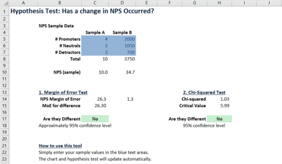
One may be the loneliest number but, when it comes to Net Promoter, Zero is more special than you realise. I’ve been saying for a while now that when someone gives you a zero in a Net Promoter Score® survey they are not just providing feedback, they are sending you a message. If you choose to respond to that message you can turn people around dramatically.
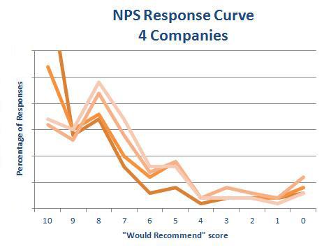
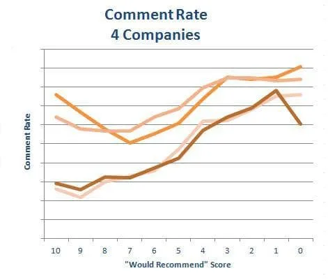
So recently I ran the numbers to get under the covers on this subject and found some very interesting results. In the process I looked at several sets of data and charted it in two ways: response rate by score and comment rate by score. See below for the charts.
The first thing to notice is that the shape of the curves is remarkably similar across all of the companies. Of course the exact proportions of each score are different as each organization has a different NPS® but the shape of the curve is very similar.
How’s This For a Response!

You can see three clear kicks in the curve at 8, 5 and 0 for all the companies. If you had a normal response curve, those kicks should not be there. So where do they come from?
8 – Happy But Not Super Happy
This is the kick at 8 and indicates people that are moderately happy but are not going near the 9 or 10 so they lump together at 8, a good but not great score.
5 – Meet Mr. Even Steven
Yep if you’re not sure where to place your bet, the middle, 5, is as good as anywhere. You could do better with these folks but they’re not getting too excited today.
0 – I’m Just Letting You Know I’m Really, Really Unhappy!
The kick at zero is interesting because if all things were equal the number of people just a little bit less happy than 1’s would be just a little bit lower, in line with the rest of the curve. But it’s not, there are twice or three times as many zeros as you might expect.
Maybe they could have given you a 1 or a 2 but not these folks: only a zero would cut it.
While it might seem that the bounce in the rate at zero is a negative you should instead view it positively. These respondents are showing that they are still engaged with your organization, even if they are unhappy at the moment. A disengaged very unhappy customer would just have ignored the survey request and moved their business elsewhere. On the other hand the zeroes can be turned around all you have to do is re-engage with them.
The Less Happy I Am, The More I’ll Tell You
Now let’s look at the comment rate. Again there is a clear theme to the data for all four organizations. The really good news is that as people are less and less happy they tell you more and more about what you’re doing wrong and how to make it right.
Sure a proportion of these respondents are just letting off steam but many of them are sincerely trying to help you. They are spending time, sometimes several paragraphs worth of time, to explain what happened and why they are not happy.
At the lowest end of the scale, 80% or 90% of respondents are providing commentary based feedback. If you are an organization that wants to improve its score then this is exactly what you need: Information.
So Do Something Already
Those Zeros are practically begging you to improve. They are still engaged and ready to provide more feedback – so call them. Make sure you set up a proactive service recovery process to contact all of the zeros. Based on our experience with other organisations you will be surprised at how positive the response will be.
Of course you’re not going to save everyone but you will save quite a few customers. Plus the calls will not be as confronting as you might expect. After the respondent picks himself or herself up off the floor they will at least discuss the issues with you and give you the opportunity to turn them around.
Remember until now all of their feedback has gone into a black hole and no one has ever called them back so you’ve already proven that you’re worth a second chance.
Also, when you do turn them around they will become your most loyal and vocal advocates. Do you really want to miss that opportunity?
So you see, Zero really is a special number. Are you using it to your advantage?
How the Data Were Collected
In these data sets there were good volumes of responses (100s or 1,000s), there were also both B2C and B2B organizations. The data were collected in Australia.
The questions included:
- “Would recommend” question
- Open Comment question