Halo effects and Brands: being cautious when reviewing customer feedback
A great score on one feedback attribute often means nothing more than a great score on brand image colouring everything else. Psychologists have known about the halo effect for a century, most CX teams still report scores as if it didn't exist. Here's how to spot it in your data, with a worked example from a Canstar mobile-phone survey.
Customer feedback surveys are subject to halo effects so you must be careful when interpreting the results. A good result in a specific attribute does not necessarily mean that you are performing well.
Halo effects have long been known and appreciated by psychologists. Per Wikipedia:
“The halo effect is a cognitive bias whereby the perception of one trait (i.e. a characteristic of a person or object) is influenced by the perception of another trait (or several traits) of that person or object. An example would be judging a good-looking person as more intelligent.”
This effect is important to those of us attempting to understand how well we are delivering to customer needs because a good score in one area, say overall brand image, can artificially lift scores in other areas of service delivery.
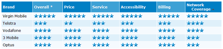
This was brought home to me very clearly in the results of a mobile phone provider survey performed by Canstar (Virgin rings true for mobile phone carrier customers) . The chart below provides the high level responses for different areas of carrier performance.
There are a couple of interesting themes in this chart:
Firstly, notice the relative similarity of responses in all areas for each carrier. For instance Virgin Mobile has 5 stars across all ratings and Vodafone has 4 stars for all ratings. This is probably an example of the halo effect: respondents are scoring the organisation in a similar way across all of the different areas of performance.
Secondly, compare the network coverage for Virgin Mobile and Optus. While Virgin receives 5 stars, Optus is only rated at 3 stars. Not that interesting until you realise that Virgin uses the same network as Optus. In fact Virgin Mobile is owned by Optus.
There may be good reasons for some difference in customer perception of coverage. The carriers may have different customer demographic profiles that lead Optus customers to be living in areas of poor coverage while Virgin customers live in areas of good coverage. However, with a claimed 96% of population covered, the difference would seem to be small and not enough to support a 40% difference in perceived coverage.
In reviewing these data it does seem that Virgin Mobile’s very high Network Coverage score owes as much to halo effects from it’s strong and positive brand association as it does to technical performance.
And, on the up side it shows that the right brand values and emotional engagement can lift overall customer perceptions in all areas of a company’s performance.
On the down side it shows that halo effects can and do alter customer perception of company performance (up and down) and you need to be careful when interpreting customer feedback.
Do you have a good example of halo effects? Leave a comment and let me know.
Want more information on customer feedback surveys?